An app full of secrets: unlocking the value TechGig was hiding from its users
TechGig had hackathons, certifications, and prize challenges but nobody could find them. This is the story of how I fixed onboarding, surfaced buried features, and turned a frustrating app into a feature hub.

My Role
Sole Designer Visual + UX
project overview
Mobile App Redesign
tool
Figma
Timeline
2 Months
what we achieved
15%
Increase in Sign-up Completion
after removing the sign-in wall and implementing native verification
22%
Higher Feature Engagement
by surfacing hackathons, webinars & skill tests on the homepage hub
07%
Improvement in Profile Completion
driven by a persistent progress bar using the Zeigarnik Effect
the situation
TechGig was getting a brand-wide visual refresh. The app needed to catch up but the problems ran deeper than skin.
TechGig is a platform for developers and tech professionals, offering hackathons, webinars, skill certifications, and coding challenges. The company was rolling out a visual revamp across the entire platform, and the mobile app was next in line.
On the surface, the brief was straightforward: update the app's visual language to match the new brand. But as the sole designer on this project, I knew a fresh coat of paint wouldn't be enough if the underlying experience was broken. So before opening Figma, I ran a heuristic evaluation and usability audit to understand what users were actually struggling with.
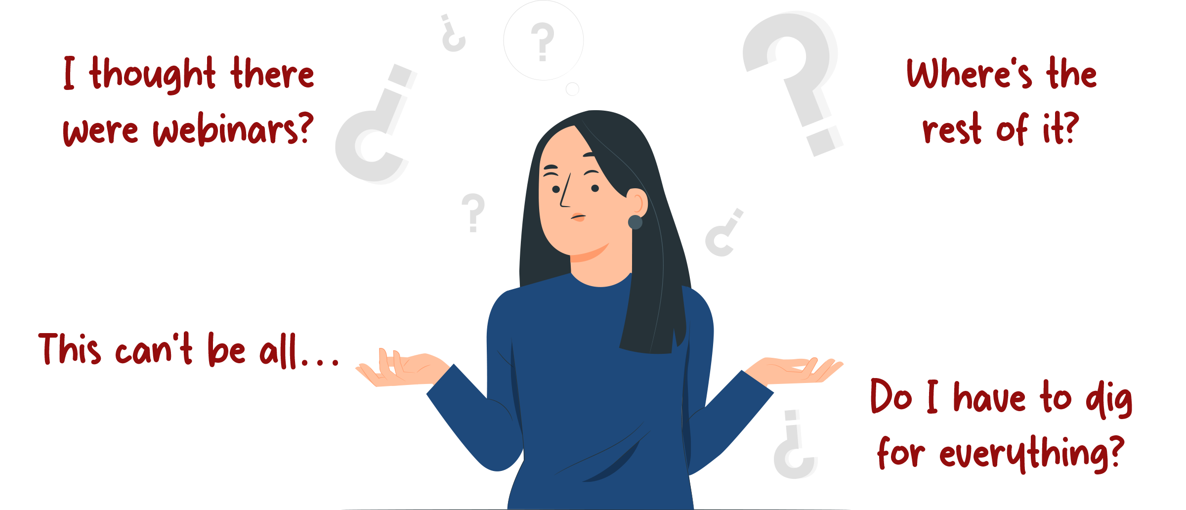
What I found changed the scope of the project entirely.
Discovery
The audit revealed three systemic problems not just visual debt
I conducted a rigorous Heuristic Evaluation (using Nielsen's 10 heuristics as a framework) paired with a Usability Audit of the existing app flows. I chose these methods specifically because I needed to identify friction patterns quickly within a 2-month timeline — there wasn't room for a full user research cycle, but I could systematically catalog every violation and rank them by severity.
The findings clustered into three clear problem areas:
The Critical Pain Points
1.
The Broken Welcome Mat: High-Friction Setup and Abandonment
The app demanded registration before showing any content at all. New users had no way to evaluate whether TechGig was worth their time — they hit a sign-in wall immediately.
Worse, the registration process itself was non-native: completing sign-up or resetting a password kicked users out of the app and into a mobile browser, then expected them to navigate back. This "app → browser → app" dance created what I started calling user limbo — and the data showed significant drop-off at exactly this point.
Sign up

password reset


Even after surviving registration, the skill selection step during personalization had a subtle but costly bug: the search input field didn't auto-clear after a selection.
Users had to manually erase their previous query before searching for the next skill, a small friction that interrupted the momentum of profile setup.

2.
The Hidden Value Problem: Low Feature Engagement
Once users got past onboarding, TechGig's most valuable features were invisible. The legacy homepage prioritized news articles, while hackathons, webinars, and skill tests, the things TechGig was actually known for, were tucked away in a secondary side drawer. Most users never found them.

This was a classic content hierarchy failure: the app was minimizing the visibility of its most valuable services, leading to artificially low feature adoption rates. Users were bouncing not because TechGig lacked value — but because the interface never showed it to them.
3.
Low Profile Completion + Persistent UI Friction
A significant number of registered users never completed their profiles, limiting personalization quality. And across the app, small interaction failures — inconsistent CTAs, unclear icons, cramped card layouts — compounded into a general sense of low quality that eroded trust.
problem statement
How might we modernize TechGig's mobile app to fix the broken onboarding flow, reorganize content hierarchy to surface core features, and maximize feature adoption all while preserving familiarity for existing users?
That last constraint was important. TechGig had an existing user base who knew where things were. I couldn't blow up the entire navigation paradigm, I needed to improve discoverability without disorienting people who already used the app daily. This tension between "new users need to find things" and "existing users expect things where they are" shaped every major decision that followed.
Strategy
Two bets: fix the front door, then transform the interior
With a 2-month timeline and a solo designer (me), I couldn't fix everything at once. I needed to prioritize ruthlessly. I organized the work into two sequential bets based on impact:
Bet 1: Fix onboarding. If users can't get into the app, nothing else matters. This was the highest-leverage fix — every percentage point improvement here compounds across all downstream metrics.
Bet 2: Restructure the homepage into a feature hub. Once users are in, they need to immediately see what TechGig offers. Moving core features from a hidden drawer to the primary screen was the second-biggest lever for engagement.
Everything else, profile completion, micro-interaction fixes, visual refinements — would be addressed as "quick wins" woven through the process. This sequencing meant I could ship the highest-impact changes first and build momentum.
Chapter 1
Fixing the Front Door (Onboarding)
Three targeted interventions to transform onboarding from a user-hostile gauntlet into a frictionless entry point.
Decision 1: Remove the sign-in wall entirely
The biggest call I made was letting users explore the app as guests before requiring registration. This was a deliberate tradeoff:
Considered
Keep the wall but streamline registration
This would have been less disruptive to existing analytics funnels and required fewer backend changes. But the fundamental problem, users couldn't evaluate TechGig's value before committing, would have remained. Streamlining a broken flow is still a broken flow.
chosen
Remove the wall — let users browse freely, prompt registration contextually
Users can now explore the full app as a guest. Registration prompts appear only when users try to take an action that requires an account (joining a hackathon, booking a webinar seat). This follows the principle of value-before-ask: let people see what TechGig offers before asking them to commit. The bet was that users who see the value will convert at a higher rate than users forced through a gate blindly.
Result: +15% increase in sign-up completion. The conversion rate improved because users who did register were genuinely motivated — they'd already seen something they wanted to engage with.
Decision 2: Make verification 100% native
The "app → browser → app" dance for sign-up and password reset was a technical debt problem masquerading as a UX problem. The previous implementation relied on web-based activation because it was easier to build but it created a catastrophic user experience on mobile.
I pushed for fully native verification. OTP-based activation that happens entirely within the app. No browser redirects, no "return to app" confusion, no user limbo.

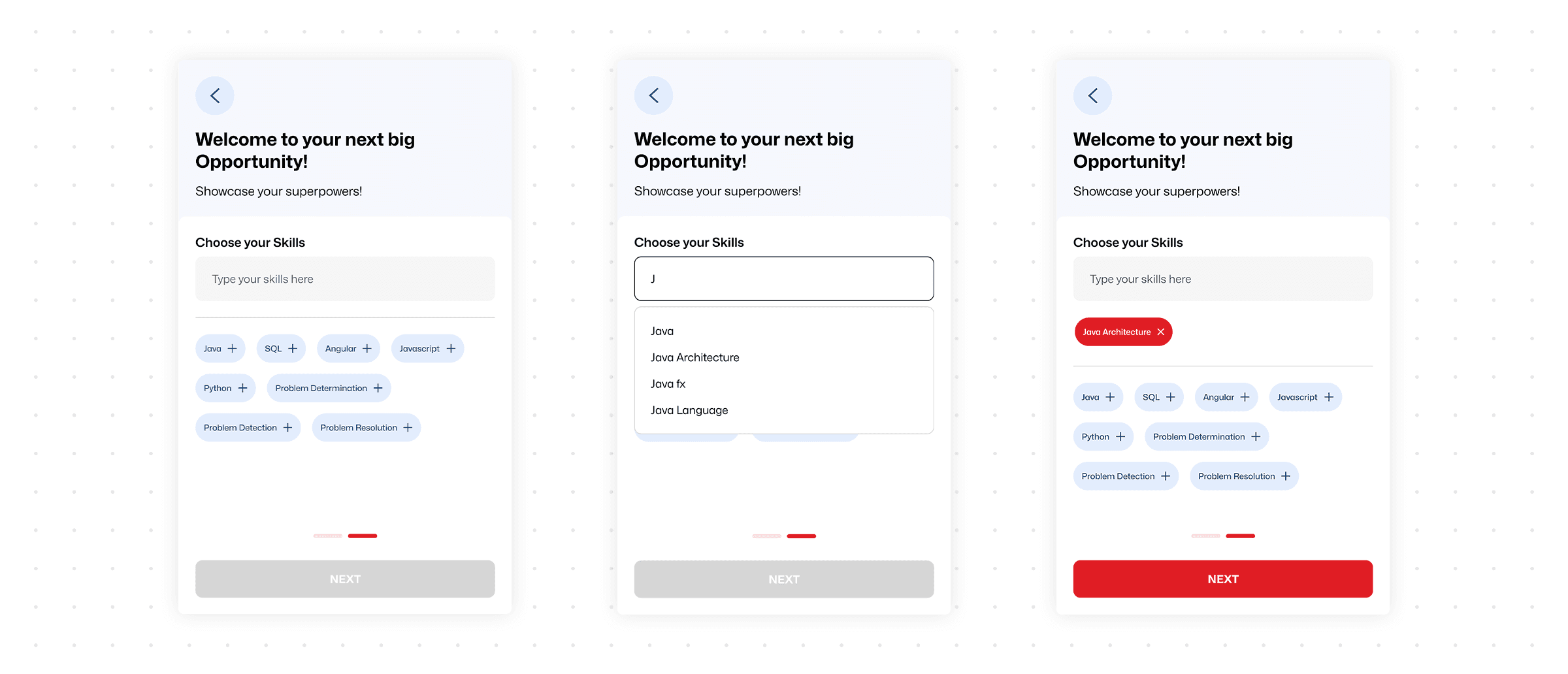
Decision 3: Redesign skill selection for momentum
For the skill personalization step, I made two changes based on the audit findings. First, the input field now auto-clears after each selection, eliminating the manual-erase friction.
Second, I added dynamic suggestions — after you pick "React," the app suggests related skills like "JavaScript" and "TypeScript" — which helps users build a stronger profile faster while reducing cognitive load.
I also surfaced the most commonly selected skills upfront as quick-tap chips, reducing the need to search at all for popular technologies.
Chapter 2
The Hub Transformation (Homepage & Discovery)
Restructuring the homepage hierarchy
The core decision here was about what deserves primary real estate. The old homepage gave it to news articles. But the audit made clear that TechGig's differentiators — hackathons, webinars, and skill tests — were what users actually came for. News was secondary at best.
Considered
Add feature shortcuts to the existing homepage
I initially considered simply adding quick-access icons or a horizontal carousel linking to features while keeping the news-centric layout. This would have been less disruptive and faster to implement. But it would have treated the symptom (features are hard to find) rather than the cause (the homepage doesn't reflect what TechGig actually is).
chosen
Rebuild the homepage as a feature hub
I restructured the homepage around dynamic preview cards for each major platform service — hackathons, webinars, skill tests — each with a clear "View All" path. News was demoted to a secondary section. This was a bigger lift, but it meant the first screen a user sees now communicates the full breadth of TechGig's offerings at a glance.
Result: +22% higher feature engagement. Hackathon and webinar registrations through the app spiked compared to the old side-drawer layout — because users could finally see them.

Driving Profile Completion with Psychology:
To address the low profile completion problem, I introduced a persistent "TG Pro" progress bar anchored at the top of the app. This wasn't just a UI element — it was a behavioral nudge grounded in the Zeigarnik Effect, the psychological tendency to remember and want to finish incomplete tasks.
I chose a persistent bar over occasional reminders or one-time prompts because the research shows that visible progress indicators create a continuous pull — users feel the incompleteness every time they open the app, rather than dismissing a one-off notification and forgetting about it.

Result: +7% improvement in profile completion. A modest but meaningful lift from a single UI element — and better user data meant better content personalization downstream.
Quick Wins: Eliminating Daily Frustration
We addressed numerous micro-interactions that were causing friction across the app, ensuring a consistently smooth experience.
News Feed
Before (The Pain)
Full-screen, swipe-based view prevented quick scanning of headlines.
After (The Solution)
Switched to a scrollable, multi-headline layout, adopting a fast, publication-style format for efficient browsing.It feels more like a tech publication now, and less like a slideshow.


Skill Test
Before (The Pain)
Tiny leaderboard icon placement caused frequent misclicks.
After (The Solution)
Replaced with a prominent button and clearly labeled text, significantly reducing accidental taps and improving navigation.


Beyond fixing the initial usability hiccup, the Skill Test section got a sleek visual upgrade. It’s now more modern, cleaner, and easier to navigate

Webinar
Before (The Pain)
No clear CTA; users unsure of next steps
Date & time info small and not prominent.
Speaker's name shown, but "multiple speakers" info missing inside webinars where there are more than one speaker.
Number shown beside a profile icon, but not contextualized (views? booked?).
Cards are tightly packed, harder to scan quickly.
After (The Solution)
Strong CTA: “BOOK YOUR SEAT”
Date and time highlighted in colored tags for easy scanning.
Speaker’s profile highlighted, and "+4 More Speakers" shown for richer context.
Participation clearly labeled as "x Participated" which builds trust and urgency.
Cards have better visual breathing room.


Before (The Pain)
Giant full-screen profile photo which eats a lot of space unnecessarily.
Speaker name and designation small, almost lost against the image.
The "+" icon next to the title does not clearly communicate whether it is intended to add the item to a playlist, like the webinar, or bookmark it.
After (The Solution)
Compact header with a focus on event title.
Speaker list shown horizontally. (main speaker + "+4 More Speakers" clearly visible)
The "+" icon is replaced with a bookmark icon, making it easier for users to understand its purpose. Additionally, the icon is now placed next to the call-to-action


The core detail pages for webinars were also visually refined for a cleaner, modern look.

Challenges
Before (The Pain)
Plain text blocks lacking visual urgency or clear action.
After (The Solution)
Implemented dynamic, image-rich cards featuring a prominent "Time Left" countdown and a strong "See Details" CTA to drive immediate engagement.


The Takeaway: Unlocking Potential
This wasn't just about giving the app a "fresh coat of paint." It was about unlocking TechGig's full potential by systematically removing the barriers that stood between the user and the platform’s best content.
The comprehensive redesign successfully achieved the dual objectives of modernizing the application's visual language and eliminating critical friction points. The result is a significantly more intuitive, accessible, and professional experience that is better aligned with the brand and ready to support higher user engagement across all key platform services.


