[Case 03]
Frodoh Reimagined: From Understated to Unmissable

Project Overview
Frodoh is a specialized Supply Side Platform built exclusively for Connected TV ad buying, powering premium CTV inventory across APAC. The goal of this project was to redesign their website from the ground up to give it a modern, clean aesthetic while clearly showcasing their offerings.
My Role
I was responsible for the redesign of the Frodoh website. This included rethinking layouts, refining the look and feel, and building out the visual system that powers the new Frodoh website.
Tool
Figma
Timeline
2 Weeks
Competitive Analysis

I saw the value of a clean and modern UI, but I wanted to take it a step further by introducing a clearer, more compelling message right up front.
It also became clear to me how important it is to explain complex offerings in a simple, approachable way. So I made sure Frodoh’s content was well-structured and spacious, steering clear of visual overload.
I recognized the risk of overwhelming users with too much content and too little organization, which is why I focused heavily on hierarchy and intuitive navigation to help users find what they need faster.
And while bold visuals can be eye-catching, I made sure Frodoh’s design never sacrificed clarity or performance for the sake of flair.
Typography and Color
The original color palette was intentionally retained to preserve brand consistency. Instead of changing it, I focused on using the existing colors more purposefully to improve contrast, establish hierarchy, and enhance clarity across the site.

Previously, Franklin Gothic Demi was used for headings and Franklin Gothic Book Regular for body text. While functional, it lacked personality and modern touch.
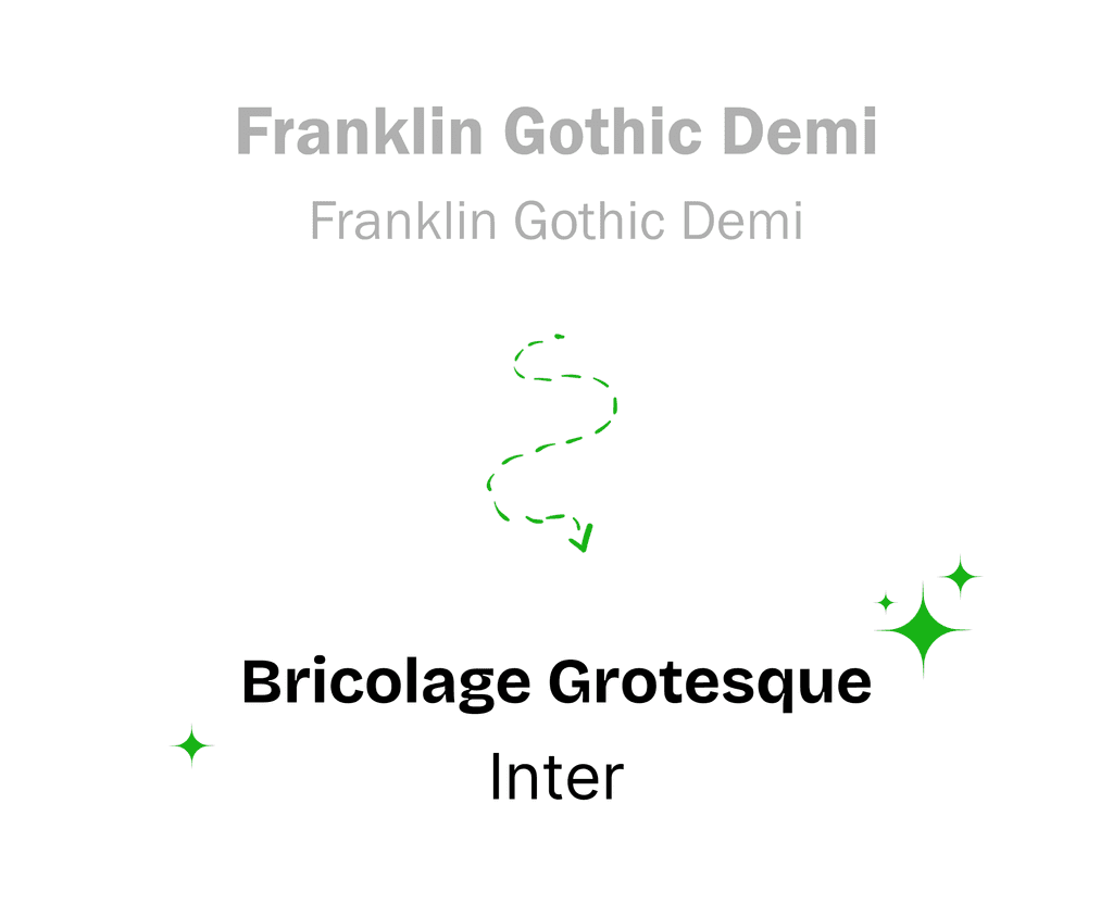
In the redesign, I introduced Bricolage Grotesque for headings to bring character and boldness, and Inter for body text to ensure readability and a clean, modern feel. This pairing added visual interest throughout the site.
Audit of the Old design
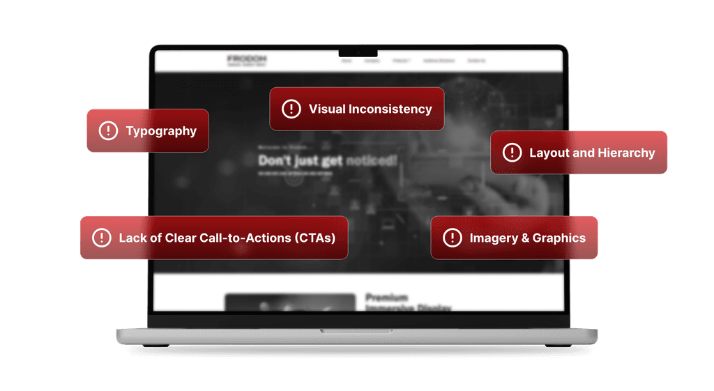
Before redesigning, I conducted a detailed review of Frodoh’s existing website from a User Interface and design perspective. Several key issues emerged that hindered the site’s ability to communicate the brand effectively and provide a seamless user experience.
Visual Inconsistency
The website lacked cohesion in its use of colors, typography, and UI elements across pages. This inconsistency weakened Frodoh’s brand identity and made the experience feel disjointed.
The overall design felt dated, with minimal use of a purposeful color palette. This limited both visual interest and the ability to guide users effectively through the content.
Layout and Hierarchy
Many pages felt cramped due to poor spacing, which led to cluttered screens and a lack of breathing room across the design.
The inconsistent alignment and hierarchy made it hard for users to focus on key information, ultimately reducing the design’s clarity and professional appeal.
Typography
Multiple font styles and sizes were used irregularly, leading to a disjointed reading experience.
Some text had low contrast against backgrounds, which negatively affected readability
Imagery & Graphics
The website relied heavily on dense text, with very few supporting images or illustrations.
Where visuals were present, they lacked impact or relevance, missing opportunities to engage users or visually reinforce the messaging.
Lack of Clear Call-to-Actions (CTAs)
The website did not provide well-defined or prominent CTAs, leaving users uncertain about what to do next.
This absence of guidance resulted in confusion and missed opportunities for engagement or lead generation.
The Upgrade Rundown
Homepage
Initial Impression Issues
The above-the-fold area of a website is the first thing users see when they land on the website, making it one of the most critical real estate zones for capturing attention and driving engagement. Since it sets the initial impression, this section must clearly communicate the brand’s core message and value proposition within seconds.

In the old Frodoh homepage, the above-the-fold section fell short in delivering a strong first impression. The main heading lacked visual prominence, failing to draw the user's attention or clearly communicate the brand's purpose.
The background image felt disconnected from the brand and looked overly generic. Worse, it clashed with the overlaid text, making the copy difficult to read and further diluting its impact. This combination not only created visual noise but also introduced confusion. There's little clarity on what Frodoh does or what services it offers.
Perhaps the most critical gap was the absence of a clear call-to-action (CTA). Without guidance on what to do next, users were left guessing, which can lead to missed engagement opportunities or early exits.
In a space that’s meant to quickly captivate, inform, and convert, Frodoh’s old above-the-fold design struggled to do any of the three.
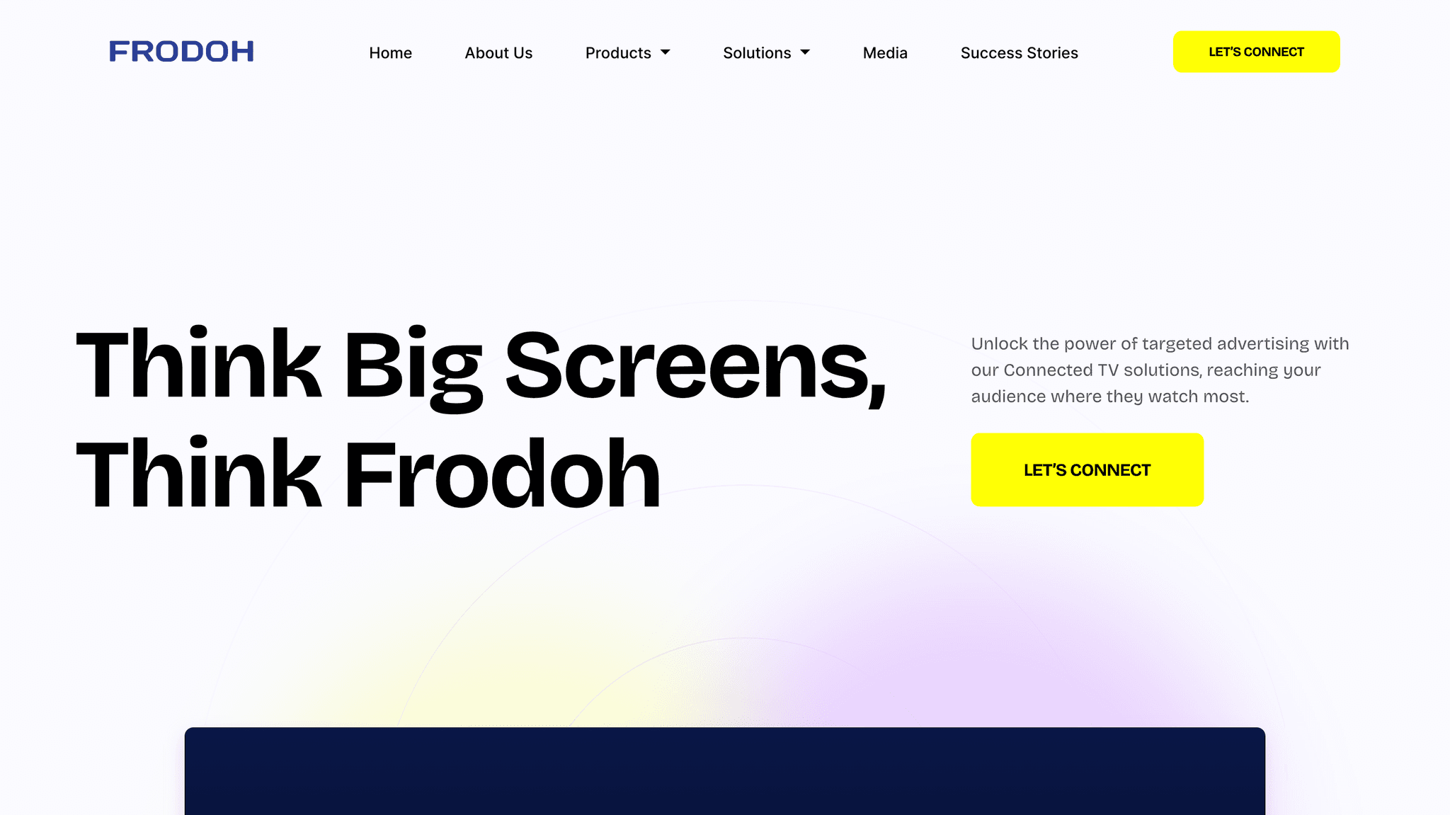
A Bold New Introduction
To make a lasting first impression, I reimagined Frodoh’s above-the-fold experience with clarity, energy, and purpose.
The redesign introduces a full-screen autoplay background video that instantly grounds the brand in the real world, showing people watching TV at home and scenes from metro stations - the very spaces where Frodoh’s ads come to life.
At the center, a bold, focused headline anchors the brand’s positioning and creates a strong visual hierarchy that captures attention. Supporting the headline is a clear and compelling subtext. Together, the messaging sets the tone for what Frodoh offers, which is, modern, screen-first, data-driven advertising.
To drive engagement, a well-placed “Let’s Connect” CTA invites users to take action, eliminating the ambiguity of the previous version. Below the main messaging, I added a compact feature strip that introduces Frodoh’s core offerings: Connected TV, Digital Out-of-Home (DOOH), and First-Screen Targeting, each paired with intuitive icons for quick visual comprehension.
The result is an above-the-fold experience that is visually engaging, informative, and conversion-ready, turning curiosity into clarity in the first few seconds.
Iterations
I explored multiple directions before arriving at the final hero section. Each iteration helped refine not just the visuals, but how we communicated Frodoh’s bold personality and offerings.
Iteration 1
Clean but Static
I started with a bright, modern layout featuring a clean white background. It looked fresh and minimal, but it didn’t quite capture the bold energy FrodoH stood for. The section felt a bit too safe, almost too quiet.
Iteration 2
Adding Motion, Still Lacking Punch
To add more energy, I introduced subtle text animations and used strips of the brand color to highlight key words. It definitely grabbed more attention, but beyond the initial visual hook, it still felt flat and didn’t carry enough weight to reflect the brand’s personality.

Iteration 3
Contextual but Generic
Next, I brought in a full-screen image of people watching TV, something that directly tied into FrodoH’s connected TV solutions. While it provided some context, the overall layout felt a little like it was missing punchy-ness.
Iteration 4
The Final Cut
This is where things clicked. I swapped the static background for a fullscreen video that immediately showcased Frodoh’s offerings in action. The video injected life and motion while clearly communicating the value proposition. I also introduced a horizontal strip underneath to highlight core services. This version felt bold and intentional.
Rushed Depth, Missing Context

Immediately after the above-the-fold section, the old Frodoh homepage jumped straight into a dense list of features — a decision that disrupted the natural flow of user engagement. Rather than building up a narrative or gradually introducing the platform’s value, the design overwhelmed visitors with a flood of technical details.
This abrupt transition lacked context and felt disjointed. There was no framing or storytelling to help users understand why these features matter or how they fit into the broader product offering. For a user still trying to grasp what Frodoh does, being hit with specifics like sensor types and ad formats so early on can be confusing and even alienating.
Moreover, the language is highly technical, better suited for a deep-dive product page than the main homepage. At this stage in the journey, users expect clarity, not complexity. There’s a critical need for a gradual buildup — starting with the problems Frodoh solves, the industries it serves, or the benefits it delivers — before moving into the mechanics.
Without proper context or visual hierarchy, the section not only felt overwhelming but also risked losing the user’s attention entirely.
Designed to Guide

To create a clearer flow after the fold, I added the “Why Frodoh?” section. A direct and engaging headline that invites users to discover what makes Frodoh unique. It serves as a direct, engaging question that immediately addresses the user’s unspoken curiosity: Why should I choose Frodoh? It invites visitors to pause and consider Frodoh’s unique value proposition without overwhelming them with jargon.
An illustrative billboard graphic labeled with the heading anchors the section, reinforcing the idea of out-of-home and big-screen advertising in a playful, memorable way.
Supporting copy highlights key benefits like advanced Connected TV solutions, data-driven targeting, premium placements, and real-time analytics, showing how Frodoh helps brands make every ad count.
Unlike the old design, which lacked clear calls-to-action, this section features a prominent “Let’s Connect” button, giving users an easy, visible way to engage and move forward.
Iterations

Iteration 1
Boxed but Disconnected
I started by placing the text inside a boxed shape to give it structure. But visually, it felt too floaty, disconnected and awkwardly placed without any anchoring elements. It didn’t carry the weight it needed to.
Iteration 2
Conceptually Strong but Visually Weak
Then I experimented with placing all the content inside a TV frame, a direct nod to Frodoh’s Connected TV services. While the idea was conceptually strong, the text ended up clashing with the video playing in the background. Dimming the video made the design feel flat, and leaving it as-is hurt readability.

Iteration 3
Too Minimal to Matter
Next, I removed all containers and let the content sit freely on the background. But this backfired, the section felt small and easy to overlook. It lacked presence and blended too much into the section below. It didn’t feel important.

Iteration 4
Bold, Branded, and Balanced
The final version placed the headline inside a bold billboard banner, a visual metaphor that connected instantly with Frodoh’s outdoor and bold media presence. The section was spaced generously above and below, giving it breathing room and clarity. It finally felt like it had purpose, presence, and the punch it needed.
Turning Interest Into Insight
Users are first introduced to Frodoh’s core concepts: Connected TV, Digital Out-of-Home (DOOH), and First-Screen Targeting, placed right at the top above the fold.

This initial glimpse provides a clear and simple overview to spark interest. As users scroll down, they arrive at the section that truly brings these concepts to life, offering detailed explanations supported by engaging imagery and carefully crafted copy. This elaboration helps users fully understand each solution’s value, making the complex offerings approachable and compelling.

This gradual reveal helps users connect the dots without feeling overwhelmed, turning initial intrigue into a deeper understanding of Frodoh’s unique strengths.
A Confident Close
After guiding users through Frodoh’s core offerings, impact, and credibility, the homepage concludes with one final, well-timed nudge. Positioned as a natural next step rather than a hard sell, this closing section invites users to take action whether they’re curious, interested, or ready to dive in.

About Us
Lacking Depth and Detail
The old About Us page on Frodoh’s website was notably brief, consisting mainly of a single paragraph that offered an overview of the company’s mission and team. While the tone was energetic and positioned Frodoh as a forward-thinking AdTech player, the page lacked depth and detailed content. Visually, the page was sparse, with no use of images or graphics to support the text or engage visitors.
This simplicity may cause visitors to feel the page is underdeveloped, missing an opportunity to build trust and showcase Frodoh’s unique story and strengths.

Building Trust Through Content
In the redesign, the “About Us” page is completely reimagined to not just inform, but to leave an impression. One of the most noticeable upgrades is the deliberate use of visuals, starting right from the top. A bold hero section with a full-width background image now sets the tone.

While the previous version stopped at a basic overview, the new layout goes further. A visual of a connected TV displaying the Frodoh logo reinforces the brand’s focus on smart AdTech for connected TV platforms, a subtle but intentional cue to help users associate the company with the space it operates in.

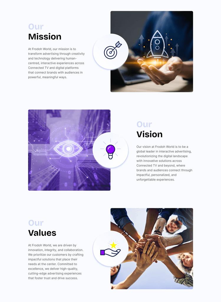
This is followed by a structured Mission, Vision, and Values section, each paired with clean iconography and relevant imagery. Instead of being just text blocks, these core brand principles are now presented with clarity and visual intent making them easier to digest and more impactful.
One of the biggest additions to the page is the Clients section which was completely missing in the earlier version. This was a missed opportunity, especially given that Frodoh has worked with several well-known brands. The new section puts those partnerships front and center. Each client logo sits within a neat block, with subtle hover interactions that enhance the overall visual experience .
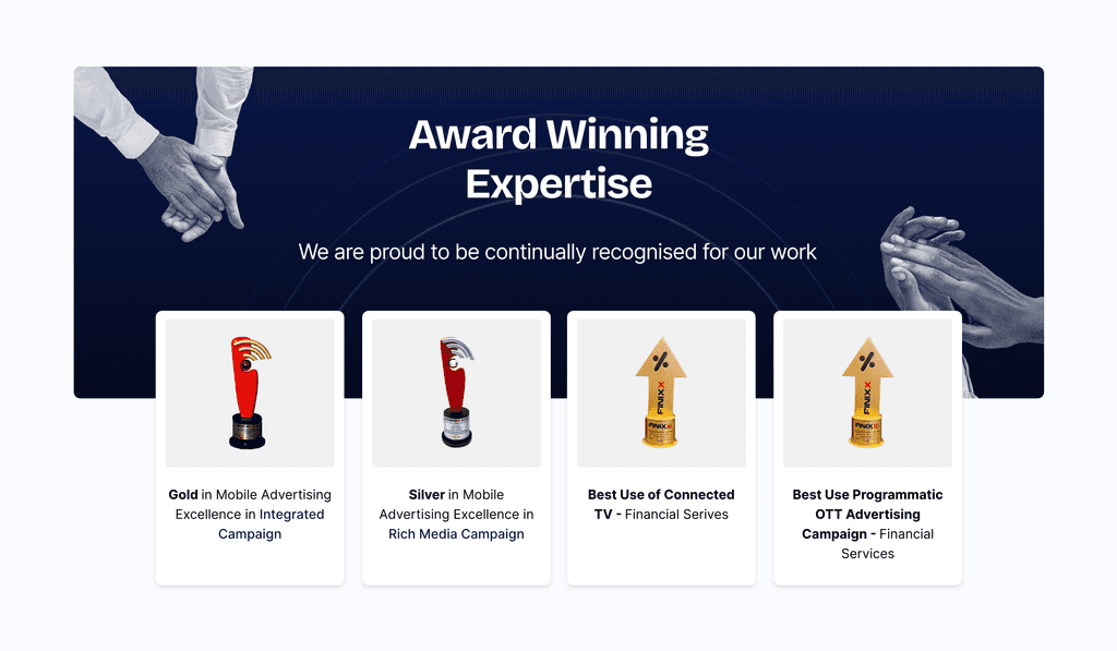
To further build trust, the page ends with an Awards section, another new addition. By showcasing industry recognition and campaign accolades, this section helps position Frodoh as not just experienced, but genuinely accomplished in their field.
Products
Overwhelming and Cluttered
The previous Product page tried to pack in a lot of information but with minimal visual support. There was a lack of imagery to bring the content to life, and more importantly, a clear absence of breathing room.
Sections were tightly packed with very little spacing or separation, making it hard for users to scan or absorb the content. Everything blended together, with little to guide the eye or emphasize priority content. As a result, users were more likely to feel overwhelmed than informed.

Enhanced Readability and Flow
In contrast to the earlier cluttered layout, the redesigned product page brings clarity and structure through thoughtful use of spacing, hierarchy, and imagery.
Each product: Connected TV, Advertise Across Devices, and Multi-Screen Advantage is clearly separated into its own section, supported by relevant imagery and concise, benefit-driven copy. The generous white space between content blocks makes the information far easier to scan, helping users process and retain key points quickly.

It's a clear example of how simple layout and design improvements can dramatically elevate both usability and perception.
Solutions Page
Visually Dull
The old Solutions page suffered from inconsistent spacing, which created a cluttered and uneven visual flow. There was no clear hierarchy in the text, headings, subheadings, and body copy didn’t stand out distinctly making it difficult for users to quickly scan or prioritize information.
Overall, the design felt flat and uninspiring, lacking any engaging elements to capture or hold the user’s attention.

Polished Presentation
The new design presents the first section in a more visually engaging way by using a bento box layout enhanced with clear numbering, adding both structure and flair. This approach helps users easily navigate and differentiate key points at a glance.

The second section mirrors the clean, spacious style seen in the About page redesign, emphasizing consistent spacing, strong hierarchy, and refined typography. Together, these design choices create a more organized, readable, and inviting experience for users.
New Pages, New Perspectives
To strengthen credibility and showcase real-world impact, the redesigned Frodoh website introduces two entirely new pages: Success Stories and Media.
Success Stories: Proof in Performance
This new section was designed to highlight Frodoh’s work with major clients and the tangible results delivered through their advertising campaigns. Instead of keeping this information buried in decks or sales pitches, we brought it front and center.
Each campaign is features a link to a more detailed case study and a downloadable PDF for offline viewing. This not only builds trust with potential clients but also positions Frodoh as a performance-driven, results-backed partner in the ad-tech space.

Media: Frodoh in the Spotlight
The Media page acts as a central hub for press coverage, showcasing articles and features from respected media outlets. It helps reinforce Frodoh’s growing presence in the industry while offering visitors a third-party lens on the company’s innovation and momentum.

Together, these additions bring a new level of transparency and depth to the site, giving visitors more reasons to believe in Frodoh’s story and capabilities.
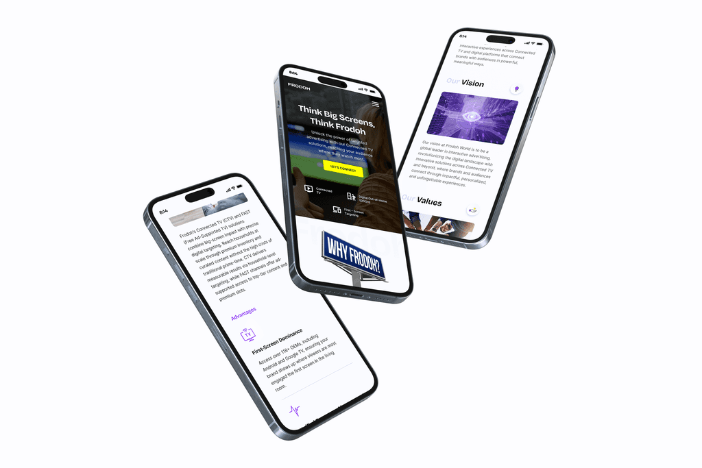
Designed to Perform, No Matter
the Screen
A great experience shouldn’t stop at desktop. That’s why every element of the Frodoh redesign was thoughtfully adapted for mobile without cutting corners.
The mobile design delivers the same clarity, polish, and impact as the desktop experience. Whether users are exploring on the go or revisiting from their phone, Frodoh remains just as bold, engaging, and easy to navigate.
Conclusion
The Frodoh website redesign transforms a technically dense and visually inconsistent platform into a clear, engaging, and user-friendly experience. By prioritizing strong visual hierarchy, consistent spacing, and compelling storytelling, the new design guides visitors naturally through Frodoh’s value proposition without overwhelming them.
Overall, this redesign not only elevates Frodoh’s digital presence but also positions the company as a confident, approachable leader in connected advertising solutions, ready to connect meaningfully with clients and partners alike.