[Case 02]
TechGig App Redesign: Merging Modern Design with Enhanced Usability

Project Overview
The goal of this project was to redesign the TechGig app in alignment with the platform’s broader visual and functional revamp. This included updating the app’s interface to reflect a fresh, modern aesthetic.
My Role
As the sole designer on this project, I was responsible for leading the visual redesign of the TechGig app. I also addressed few UX issues to enhance usability while maintaining the existing user flow to preserve familiarity for current users.
Tool
Figma
Timeline
2 Months
Status
In Development


A Fresh Coat of Paint (and Then Some)
Typography and Color

ONBOARDING
Joining, Without the Jumps
A few problems popped up right from the start, before users even reached the homepage. The app’s onboarding process? Far from smooth.
Lost in the First Step

In most cases, if the user tried to return to the app after clicking the activation link, they were stuck on a screen that just said the link had been sent. This halted the entire onboarding process, leaving users in limbo.


The onboarding process felt disjointed, forcing users to leave the app and navigate through multiple steps in the browser, leading to confusion and frustration.
A Smoother Start
All these issues are addressed in the redesign. Users no longer accidentally leave the app or get stuck in the process, whether it’s verification or password resets, everything now happens within the app. The screen also receives a cleaner, fresher look, modernizing the overall experience.

Loosing Momentum
Next, the user was guided through screens where they selected whether they were a professional or a student, followed by a step to choose their skills. Skill selection played a crucial role in personalizing the experience, as the webinars, challenges, and hackathons shown to the user were curated based on the skills they picked.


Getting You Set Faster
In the redesign, once users choose whether they are a Student or a Professional, they are immediately asked for relevant details. Students fill in their College and Course, while Professionals provide their Job Role and Company Name.
This small step ensures that the app starts tailoring content, opportunities, and recommendations right from the beginning, making the experience feel more personalized and relevant without adding friction.

In the redesigned skill selection screens, users are shown popular and commonly selected skills upfront, making it easier to get started. After a skill is selected, the input field automatically clears, allowing users to immediately search for the next skill without any manual effort.
Additionally, the suggestions update dynamically, showing more related skills based on the user's selections, helping them build a stronger and more relevant skill profile.

False Sense of Personalization

HOMEPAGE
Turning the Homepage Into a Hub
TechGig offers a lot, including news articles, skill certification tests, hackathons, prize challenges, webinars, and podcasts. You name it.
But in the old design, the homepage only showed article listings, leaving all the other features buried in the side drawer.


One of the oddest things - Podcasts. They showed up in the article list looking exactly like every other article, nothing to set them apart.
The user would tap on a link, expecting it to be a regular article, only to discover that it was podcast. However, there was no play button, no link, and no way to actually listen to it, just text.

Bringing It All to the Front
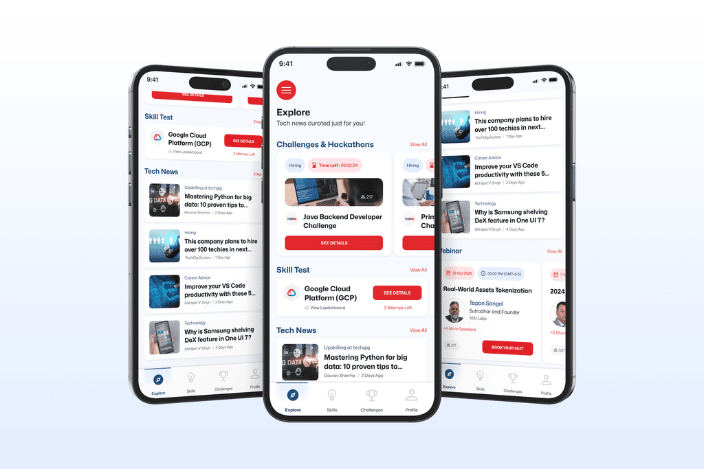
SKILL TEST
Simplifying the Skill Journey

To fix that, the new design swaps out the tiny leaderboard icon for a proper button, making it less prone to accidental taps.
The leaderboard itself is moved just below the skill title, now clearly labeled with text so users know exactly what it is.

Beyond fixing the initial usability hiccup, the Skill Test section got a sleek visual upgrade. It’s now more modern, cleaner, and easier to navigate

NEWS
A Smoother Way to Stay Informed
The news section was meant to keep developers in the loop, with curated stories, updates, and trends from the tech world. But in its earlier form, it was far from easy to explore.
One Story at a Time
The old design leaned heavily into visual storytelling. It showed just one story at a time, with a full-screen image and swipe-based navigation.
While visually striking, it wasn’t the most efficient. Users had to swipe blindly through stories, unable to scan headlines quickly or see what was coming next. The heavy imagery and dark overlays added more visual weight than needed, distracting from the content itself.

A Smarter Way to Browse

The updated design transitions from a visual storytelling approach to a reader-first, efficient discovery model, significantly enhancing usability, speed, and clarity.
WEBINAR
Smarter Access to Shared Knowledge
TechGig hosts webinars featuring tech leaders from top companies, sharing insights, trends, and real-world knowledge to help developers grow and stay updated.
Then
No clear CTA; users unsure of next steps
Date & time info small and not prominent.
Speaker's name shown, but "multiple speakers" info missing inside webinars where there are more than one speaker.
Number shown beside a profile icon, but not contextualized (views? booked?).
Cards are tightly packed, harder to scan quickly.
Now
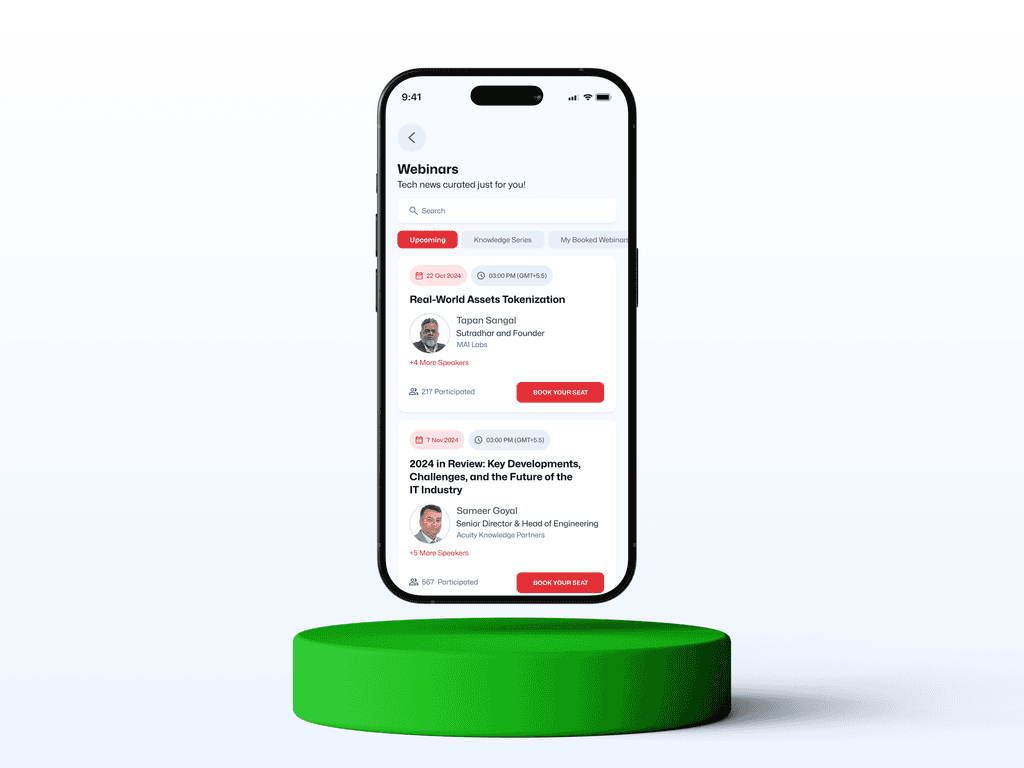
Strong CTA: “BOOK YOUR SEAT”
Date and time highlighted in colored tags for easy scanning.
Speaker’s profile highlighted, and "+4 More Speakers" shown for richer context.
Participation clearly labeled as "x Participated" which builds trust and urgency.
Cards have better visual breathing room.
Then

Giant full-screen profile photo which eats a lot of space unnecessarily.
Speaker name and designation small, almost lost against the image.
The "+" icon next to the title does not clearly communicate whether it is intended to add the item to a playlist, like the webinar, or bookmark it.
Now

Compact header with a focus on event title.
Speaker list shown horizontally. (main speaker + "+4 More Speakers" clearly visible)
The "+" icon is replaced with a bookmark icon, making it easier for users to understand its purpose. Additionally, the icon is now placed next to the call-to-action

CHALLENGES
Making Challenges Feel Inviting
TechGig runs coding challenges, some with prizes and others for hiring, where developers compete, solve real problems, and sharpen their skills in the process.
Then

Challenge cards are very plain. Almost just text blocks.
Date and time not given visual prominence to convey urgency.
No direct call to action (CTA) like "See Details" — just a passive list.
Now

Dynamic challenge cards with images. Making each card more visually distinctive.
"Time Left" countdown prominently shown which creates urgency to act.
Clear, strong red CTA button ("See Details") added.
PROFILE
Your Space, Redesigned
The profile section also gets a fresh visual upgrade, now looking much cleaner, more modern, and easier to navigate.

Wrapping it Up
This redesign was all about giving the TechGig app a fresh, modern face while keeping the core experience familiar for existing users. From surfacing key features on the homepage to cleaning up UI pain points across sections like Skill Tests and Challenges, every change aimed to make the app more intuitive, accessible, and visually consistent with TechGig’s evolving brand.
The result? A smoother, smarter experience that feels right at home for both new and returning users.