[Case 01]
TechGig 4.0: Unifying the Experience

Project Overview
TechGig, a leading Indian tech talent platform, initiated a full platform revamp to modernize the user experience, enhance usability, and remain competitive in a rapidly evolving landscape.
A major focus of this revamp was overhauling the design system to establish a clean, modern visual identity and ensure consistency across the platform.
My Role
As the sole designer on this project, I was fully responsible for creating the new design system from the ground up. This included auditing the existing system, defining the visual language, building scalable components in Figma, and ensuring consistency across all UI elements.
❌ Problem
Lacked defined variables and component variants in Figma, making it difficult to maintain consistency.
Limited color palette, missing essential shades needed for accessibility and visual hierarchy.
Typography lacked clarity and didn’t align with modern UI standards.
✅ Solution
Introduced reusable components and smart variants in Figma to streamline design and ensure consistency.
Expanded and defined a comprehensive color system using Figma variables, improving accessibility and visual clarity.
Refined typography styles and established a clear typographic scale aligned with best practices in modern UI design.
🎯 Result
The TechGig 4.0 design system brought clarity and structure to our workflow. With a well-defined set of components, tokens, the team could move faster, maintain consistency, and focus on solving real design challenges. It simplified onboarding, improved collaboration with developers, and gave us the flexibility to scale without compromising on quality.
Revamping the Experience: What’s Changed?
COLOR
More Than Just Pretty Colors
The old color palette lacked a variety of shades, which limited creative flexibility for designers. Without a well-defined range of shades, it was difficult to maintain visual consistency and hierarchy throughout the platform.

To resolve this, I created a well-structured color palette with multiple shades for each core color, all properly defined and organized as Figma variables to ensure consistency and ease of use across the design system.

From Chaos to Clarity
Building a Smarter Color System
With the expansion of the color palette from the previous design system, it became essential to organize and define these additional shades using Figma variables.

I structured the color variables in 3 sections. First defining the raw brand colors, then organizing them into semantic aliases, and finally mapping them to specific UI use cases. This approach ensured consistency, scalability, and a streamlined design process across the platform.
I defined the raw brand color values in Figma as part of the brand variable collection, including blues, greys, and reds, each with a full range of shades (e.g., Blue100 to Blue800).
At this stage, these colors served as the base palette to represent the brand’s visual identity without functional use.


Next, I created alias tokens to assign functional meaning to the brand colors, grouping them into categories like primary, secondary, neutral, success, and alert.
This added semantic clarity, making it easier to understand each color’s role in the UI.
Finally, I mapped the alias tokens to specific UI roles and use cases—such as text-default, surface-background, button-primary, and border-muted. These mapped tokens are what designers and developers use when building actual components.
By linking them to the alias layer, any future updates to brand colors can automatically cascade through the system, making it much easier to maintain and scale the design consistently.

By using Figma’s variable system, I made the tokens reusable, easy to update, and organized by function, enabling the system to grow and evolve alongside the product.
TYPOGRAPHY
The New Face of Type
As part of the design system overhaul, I updated the typography from Lato to Mona Sans to better align with the modern, clean aesthetic we aimed for. This change gave the platform a more contemporary and cohesive look across all screens.

No Figma variables used, leading to inconsistencies in the design.
Lacked font weight differentiation (Regular, Medium, Bold).
Manual adjustments for typography updates, increasing risk of errors.

Implemented Figma variables, ensuring consistency and easy updates.
Added font weight differentiation (Regular, Medium, Bold) for better visual hierarchy.
Streamlined typography management, improving scalability and maintainability.

Type that Scales
Creating Type Harmony

This setup allowed text styles to adapt seamlessly from desktop to mobile, enabling a consistent and scalable experience without the need for manual adjustments.

Styled for Consistency

SCALE
The Invisible Rhythm
In the previous design system, a scaling system was not defined, which made consistency across different components and screen sizes difficult.
👕
In the new system, I introduced a scaling system within the variables, allowing for flexible and consistent scaling of UI elements. The scale system was defined using the T-shirt sizing method (3XS to 3XL).

COMPONENTS
Smart Parts, Seamless Interfaces

In the previous design system, many components either didn't exist or lacked the flexibility needed to adapt to different scenarios, which led to an inconsistent and time-consuming design process.
Polishing the Essentials
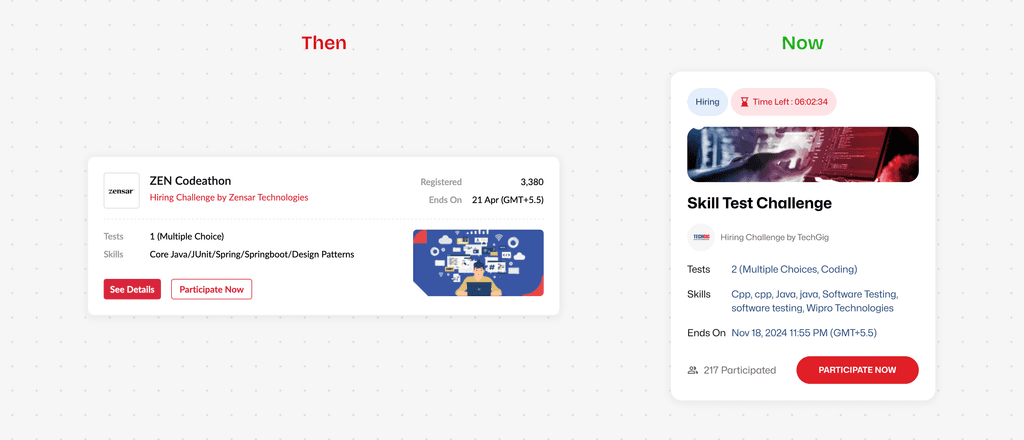
Challenge Test Card
One of the most frequently interacted-with elements, the Challenge Test Card received a modern, streamlined redesign. The time countdown, crucial for users, was given higher visual priority, making it more prominent and easier to scan at a glance.

Listing Cards
The Listing Cards also underwent a visual refresh to better align with the updated design system. They were redesigned to be cleaner, more structured, and visually engaging, improving readability and interaction without overwhelming the user.
These are just a couple of components that received a fresh redesign. In fact, almost every component underwent a similar overhaul, ensuring a cohesive and modern look across the entire system.
Unlocking Flexibility with Variant Properties
A major change was making use of variants properties within the components. In the previous system, components were static and lacked this functionality, which made them inflexible and inefficient for designers.
↘️
The use of the arrow before the properties was introduced to make it easier for designers to quickly identify which elements affected specific parts of the component.

This added a significant amount of flexibility and streamlined the design process. Now, making global changes to the component styles or behaviors is much easier, saving time and improving consistency across the product.
Moving Foward
This is just the beginning. While the design system has laid a strong foundation, the TechGig revamp is an ongoing journey. As the product evolves, the system will continue to grow and adapt alongside it, supporting new features, expanding use cases, and refining components over time.
It’s helped us start strong, bringing clarity and speed to our early efforts, but there’s still much more to build, test, and improve. The process is long, but with the right system in place, we’re set up to move forward with confidence.